Colors have a powerful effect on how we feel and how we experience the spaces around us. In home decor, the right color choices can make a room feel larger, cozier, more energetic, or more relaxing. If you want to make your home more beautiful and functional, learning to use color intentionally is a great place to start.
Here’s how you can use color to bring out the best in every room of your home.
Understanding the Psychology of Colors
Different colors can evoke different emotions and atmospheres. Before you choose a color for a space, consider what kind of mood you want to create.
- Blue: Calming and serene, perfect for bedrooms or bathrooms
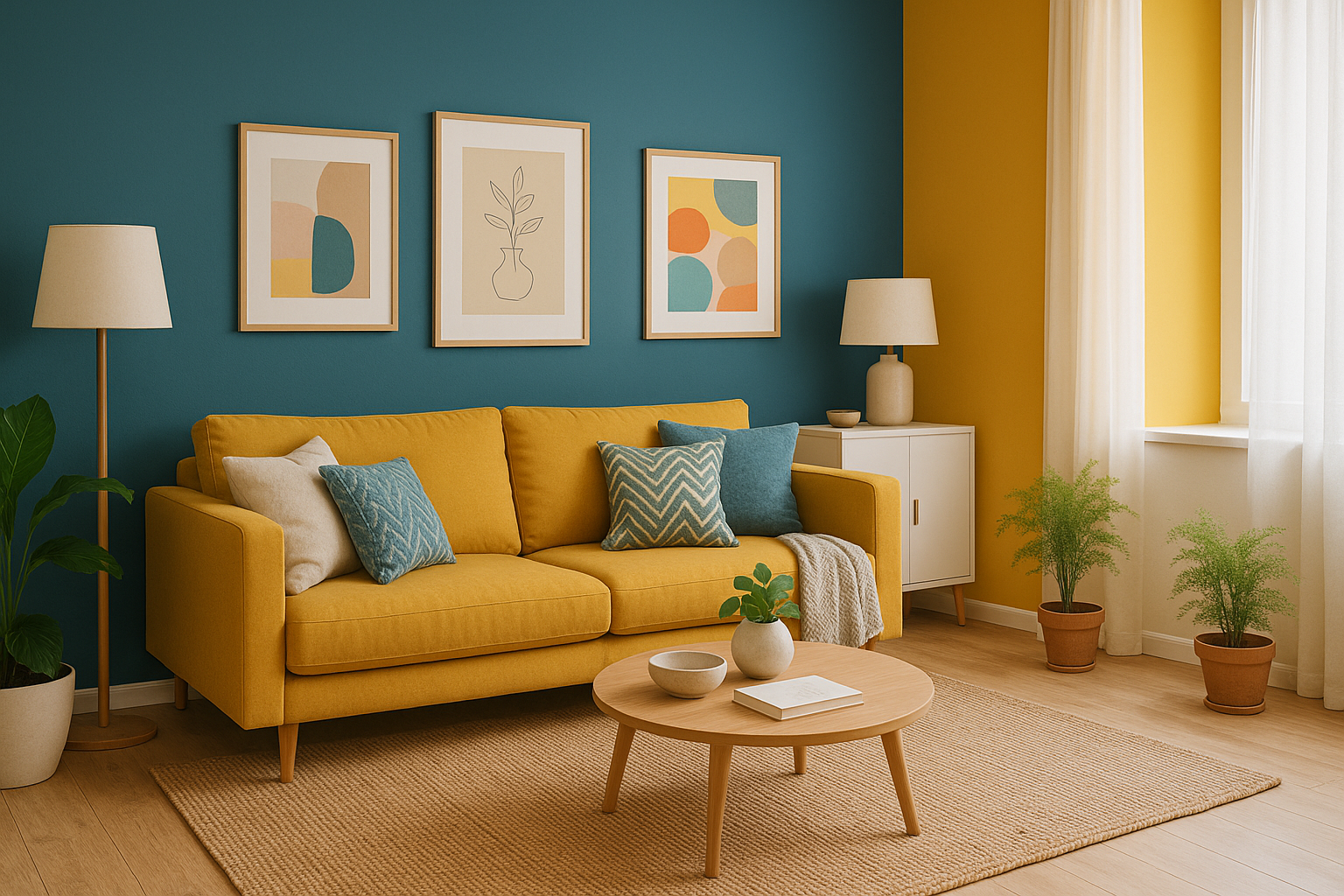
- Yellow: Cheerful and warm, ideal for kitchens or breakfast nooks
- Green: Refreshing and natural, great for living rooms or home offices
- Red: Energetic and bold, best in small doses (like accents or dining rooms)
- Gray: Neutral and sophisticated, works in almost any room
- White: Clean and airy, helps make spaces look bigger
- Black: Dramatic and elegant, perfect for accents or statement walls
- Beige and earth tones: Warm and inviting, great for common areas
Understanding these emotional associations helps guide your decisions.
Consider Natural Light and Room Size
The way a color appears in your home depends heavily on lighting.
- In a room with lots of natural light, you can use deeper or bolder colors without making the space feel small.
- In rooms with little light, opt for lighter colors to make the space feel more open.
- Warm colors (like reds, oranges, and yellows) tend to make rooms feel cozier.
- Cool colors (like blues and greens) can make a space feel calmer and more expansive.
Small spaces benefit from light, cool colors. Large rooms can handle darker or warmer shades without feeling cramped.
Use a Base Color and Build Around It
To create harmony, choose a base color for your home or each room. Then build a palette around that shade using complementary or analogous colors.
- Monochromatic: Use different shades of the same color
- Analogous: Use colors next to each other on the color wheel (e.g., blue, teal, and green)
- Complementary: Use opposite colors on the color wheel (e.g., blue and orange)
These approaches help you stay consistent while giving depth to your decor.
Accent Walls: A Bold But Safe Move
Painting one wall a different color — usually a bolder shade — is an easy way to add drama and personality without overwhelming a room.
- A dark blue accent wall in a white room can create elegance.
- A terracotta or burnt orange wall in a neutral room adds warmth.
- A sage green wall behind a bed can create a calm, restful vibe.
Accent walls also work well behind TVs, headboards, or desks.
Add Color Through Accessories
You don’t always need to paint! If you’re renting or just don’t want to commit to a bold color scheme, use accessories to add color:
- Throw pillows
- Rugs
- Curtains
- Lamps
- Vases
- Wall art
- Books and decorative objects
These are easy to change when seasons or tastes evolve.
Match Color to Function
Each room serves a different purpose — and color can help support that purpose.
Living Room
- Use warm neutrals like beige, taupe, or greige for versatility.
- Add pops of color with cushions or artwork.
Kitchen
- Whites and soft blues can feel clean and fresh.
- Yellow can make it feel bright and energizing.
Bedroom
- Go for cool tones like light blue, soft gray, or muted green.
- These colors promote relaxation and better sleep.
Bathroom
- Try light blue, aqua, or white for a clean, spa-like feeling.
- Soft greens can also give a refreshing look.
Office or Study
- Green promotes focus and balance.
- Light gray or navy blue can create a productive atmosphere.
Use Color to Guide the Eye
Designers often use color to guide the flow of a home. For example:
- Using the same base color throughout open-concept spaces creates unity.
- Changing the color palette subtly between rooms helps define function.
- A color repeated in small elements (like frames or textiles) can tie the whole house together.
Don’t Forget About Ceilings and Floors
Most people focus on walls, but ceilings and floors can add impact too:
- A white ceiling makes a room feel taller.
- A painted ceiling in a soft tone (like pale blue or blush) adds a subtle touch.
- Floors in warm wood tones bring balance to cool walls.
Color continuity from floor to ceiling can help a space feel intentional and designed.
Test Before You Commit
Always test a color before painting a whole room. Buy a sample and paint a small patch on the wall. Observe it during different times of day and in different lighting.
What looks beige in the store might appear pink or gray in your home depending on lighting and surroundings.
Final Touch: Personal Taste Comes First
Trends come and go, but your home should reflect your personality and lifestyle. Choose colors that make you feel good. If you love bright orange or deep purple — go for it. There are no strict rules, only guidelines that help you make better choices.
Wrap-Up: Let Color Work for You
Color is one of the easiest and most affordable ways to refresh your home. Whether you’re doing a full renovation or just want to update one room, smart color choices can change how you feel and function in your space.
Start with a goal — do you want the room to feel cozy, calm, lively, or elegant? Let that intention guide your palette, and you’ll be surprised how powerful the right colors can be.